ACQUIRED · EBAY
A shopping cart that sells.
How a redesigned checkout lifted Twice’s per-customer revenue by 16% — and proved two “rules” of good design wrong.
Four designs tested. The numbers chose the winner.
 CONTROL · THE EXISTING DESIGN
A full, dedicated checkout page — the “standard” recommendation. It hid navigation to force focus, and users found it disorienting.
CONTROL · THE EXISTING DESIGN
A full, dedicated checkout page — the “standard” recommendation. It hid navigation to force focus, and users found it disorienting.
 VARIATION 1 · TEASER CART
A mini-cart tucked in the top corner. It exposed too little actionable information and couldn’t carry a full checkout.
VARIATION 1 · TEASER CART
A mini-cart tucked in the top corner. It exposed too little actionable information and couldn’t carry a full checkout.
 VARIATION 2 · LARGE VISOR
A radical expanding/collapsing visor — a first for Twice and most retailers. Promising, but still short on information.
VARIATION 2 · LARGE VISOR
A radical expanding/collapsing visor — a first for Twice and most retailers. Promising, but still short on information.
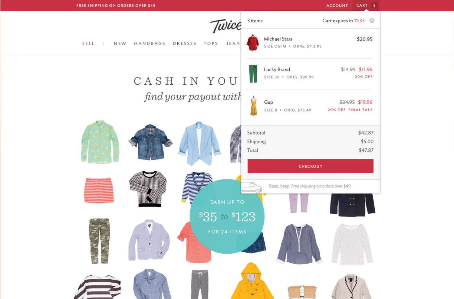
 VARIATION 3 · LARGE VISOR COMPLETE · WINNER
Everything condensed into one dense visor. High information-density yielded the most profit — and won the test.
VARIATION 3 · LARGE VISOR COMPLETE · WINNER
Everything condensed into one dense visor. High information-density yielded the most profit — and won the test.
 REDUCE RECALL
Common shipping questions — pulled from real support tickets — sat right next to the inputs, so users never had to remember.
REDUCE RECALL
Common shipping questions — pulled from real support tickets — sat right next to the inputs, so users never had to remember.
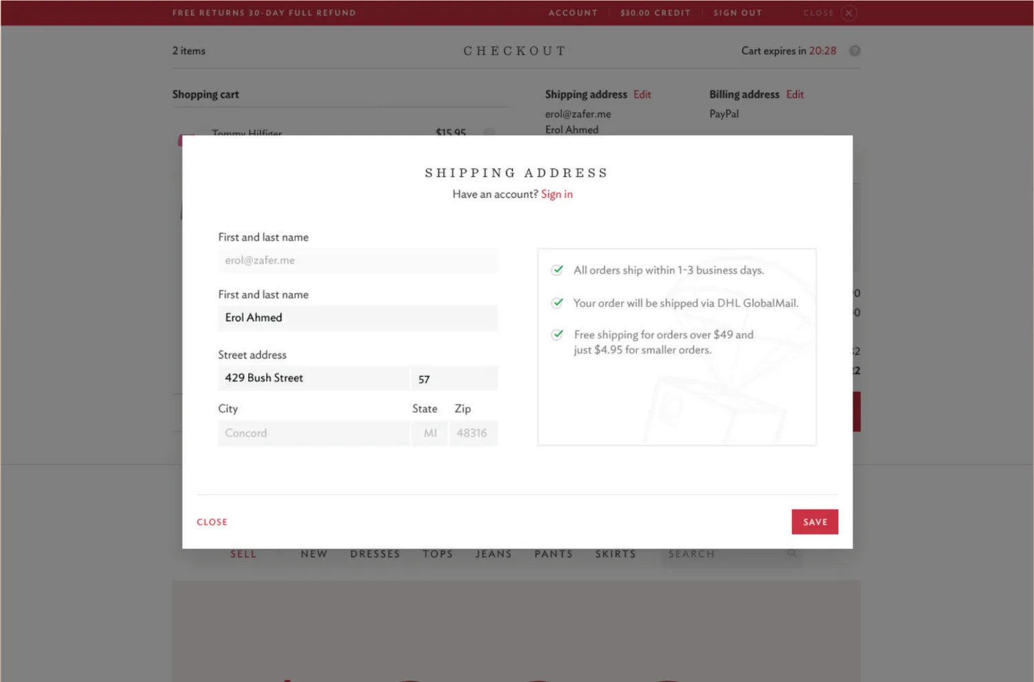
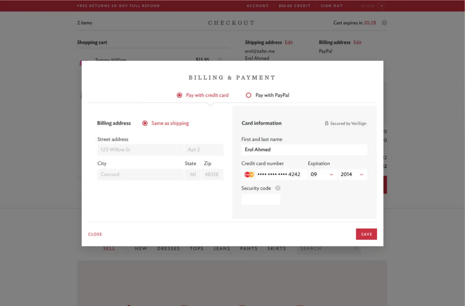 COMPARTMENTALIZE
Payment methods, addresses, and options split into discrete modal steps that each finish quickly in isolation.
COMPARTMENTALIZE
Payment methods, addresses, and options split into discrete modal steps that each finish quickly in isolation.
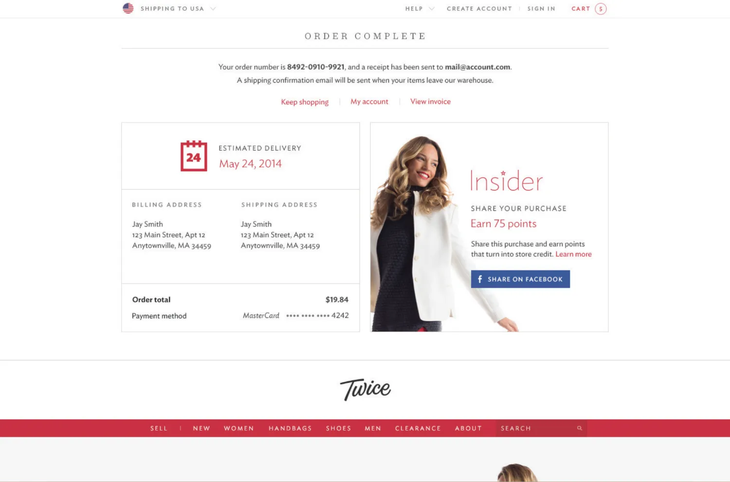 GET OUT OF THE WAY
A clean order recap, then dismiss to keep shopping. Repeat purchases dropped to as little as 1–2 clicks.
GET OUT OF THE WAY
A clean order recap, then dismiss to keep shopping. Repeat purchases dropped to as little as 1–2 clicks.
Twice (acquired by eBay in 2015) was an online retailer of secondhand clothing — hundreds of thousands of monthly visitors and tens of thousands of items listed each month. With inventory that spoiled if it didn’t move, the checkout wasn’t just a form. It was the business.
THE WORKThe cart “worked” — so the team had been afraid to touch it. Punch ran a data-driven redesign: define one experiment (revenue per visitor), build several cart variations internally, and A/B-test the strongest against the live control. No opinions; the numbers picked the winner.
The winner was a visor cart — an information-dense panel that pushes the page down instead of covering it, with complex paths (shipping, billing, payment) broken into in-page modals. It overturned two received beliefs: that focus needs a separate page, and that simplicity means showing less. It doesn’t — it means less mental effort.
 Case study PDF ↓
ACQUIRED
Twice → acquired by eBay, 2015
Case study PDF ↓
ACQUIRED
Twice → acquired by eBay, 2015